Developed and shared foundational design guidelines with our developers to maintain design consistency.
The first essential element of a design system is a well-structured grid layout for all web pages.
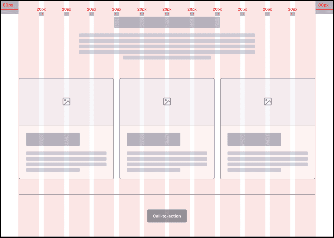
Auto Grid System for minimum desktop size ie. 1440x1024 px
Using a 4pt grid system to align with industry standards.
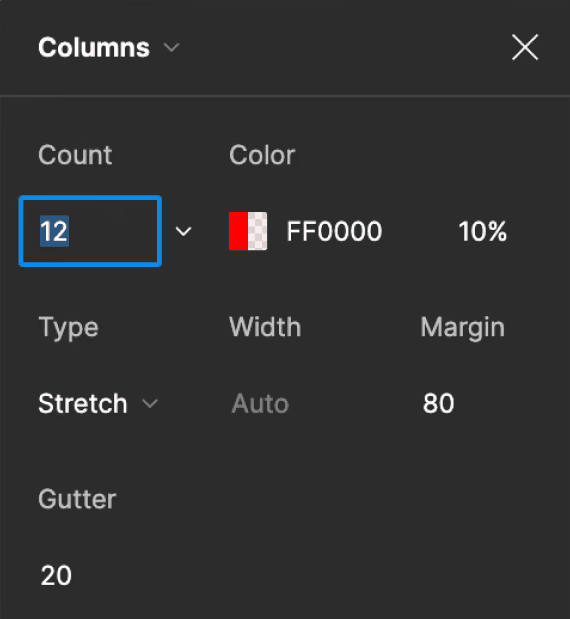
12-column grid for flexibility, as it’s divisible by 3 and 4, enabling multiple layout variations.
Applied an 80px minimum margin for screens at the minimum width before the desktop threshold, providing balanced spacing.
20px gutter between columns for consistent spacing.
Column width set to auto to ensure even distribution across the 12 columns.
Icons
Auto Grid System for minimum desktop size ie. 1440x1024 px
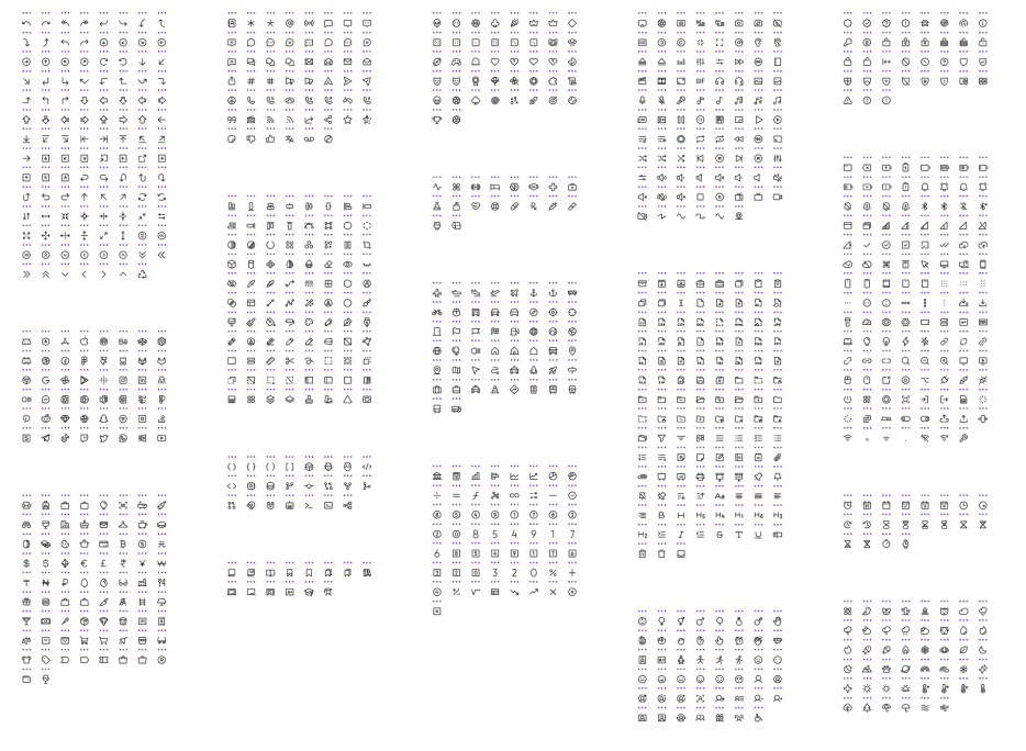
Choose an existing free icon library or create custom icons based on your preference.
I used an icon library with 32x32px icons that includes two variations:
Outline
Filled
Ensure all icons are made into components to allow quick adjustments in the designs.
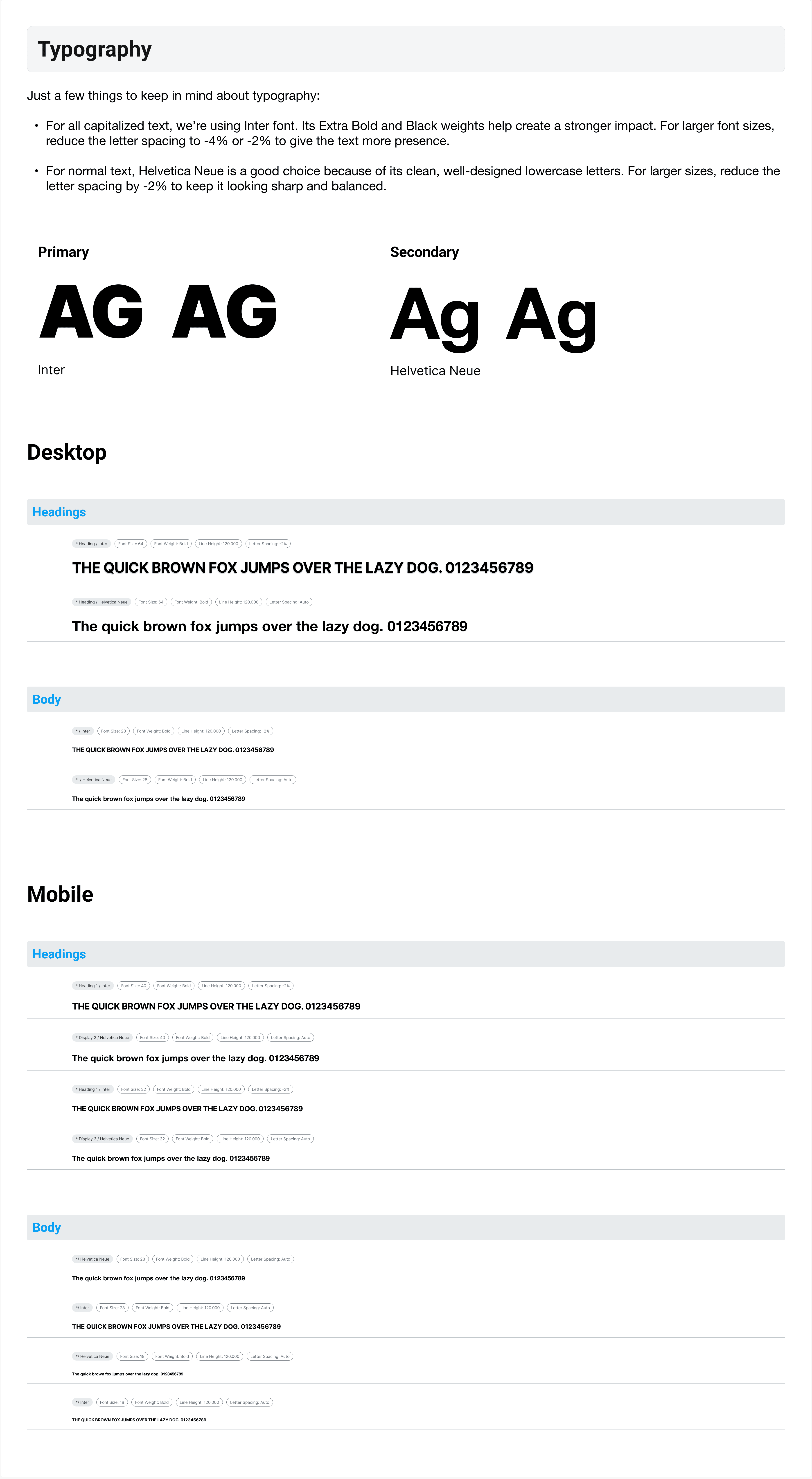
Typography
Here is a screenshot for reference
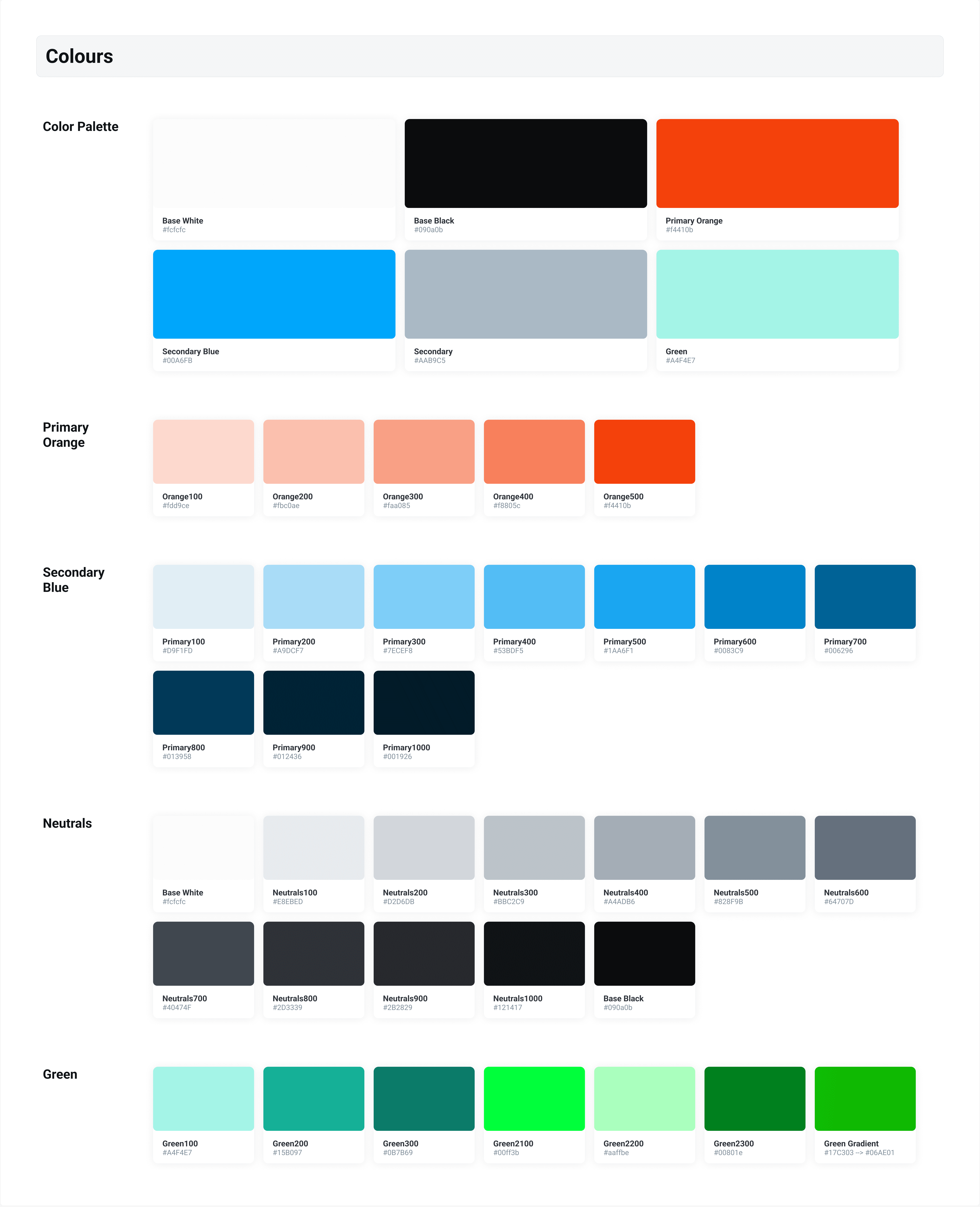
Colours
Here is a screenshot for reference
Input Feilds
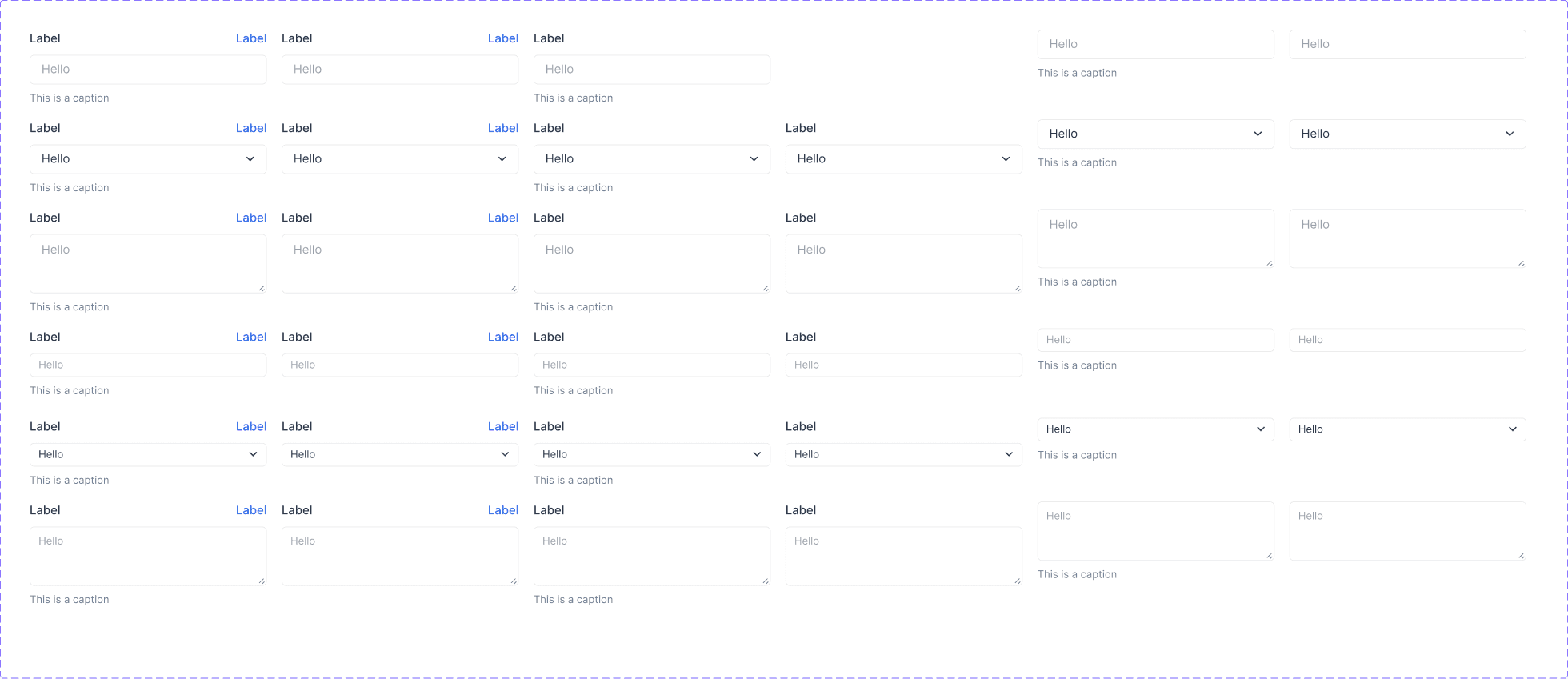
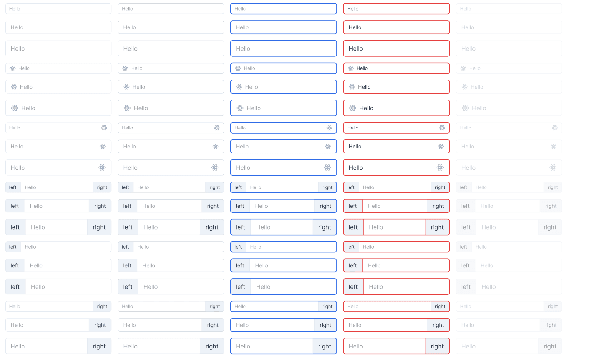
• Field States: Default, Hover, Focus, Error, and Invalid/Ghost.
• Icon Placement: Allow for left and right icon combinations (Tip: Use component icons for easy swapping).
• Sizes: Create sizes in small (sm), medium (md), and large (lg).
• Variants: Offer styles like Outline, Filled, and Flushed.
Buttons
• Field States: Default, Hover, Focus, Error, and Invalid/Ghost.
• Icon Placement: Allow for left and right icon combinations (Tip: Use component icons for easy swapping).
• Sizes: Create sizes in small (sm), medium (md), and large (lg).
• Variants: Offer styles like Outline, Filled, and Flushed.

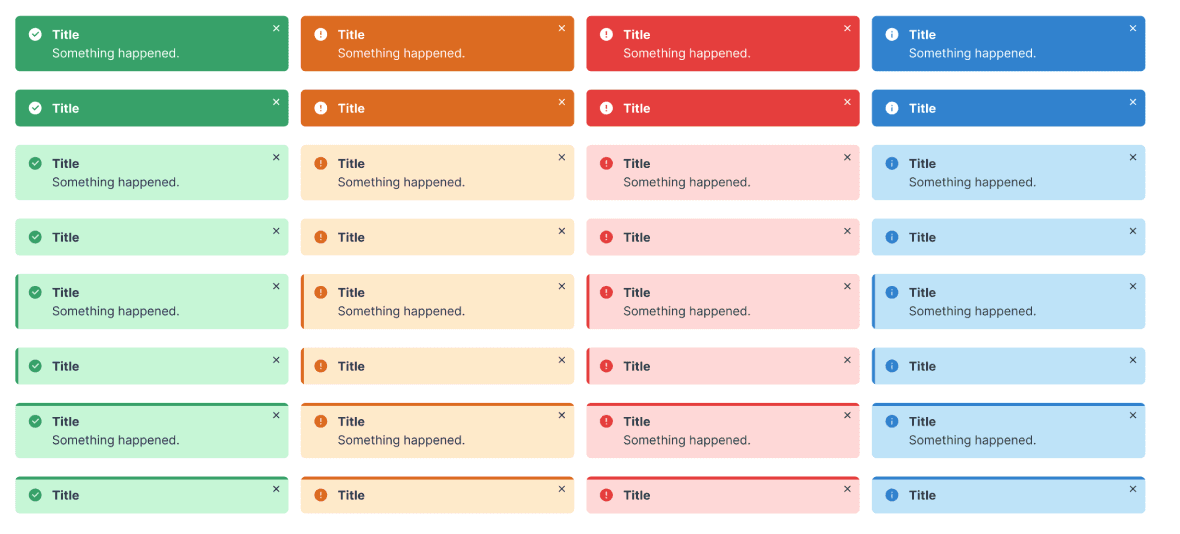
Toasts
For web-based projects, toasts are essential for displaying the status of an action taken by the user. Having a few key variations is often sufficient to convey different states effectively.
Tables and Columns
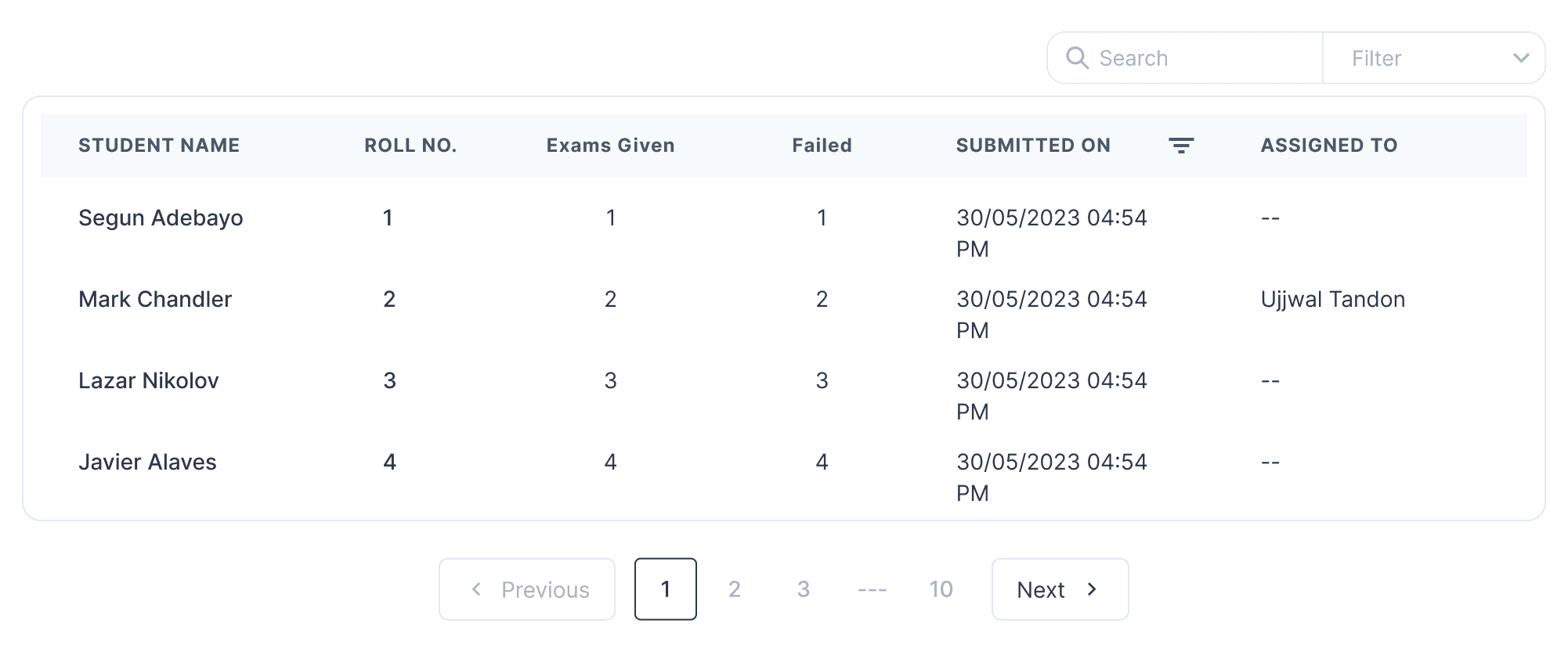
Design for our internal dashboards.
